As a journalist or civil society activist it can be very useful to visualise data geographically via mapping.
A map allows you to gain location-related insights you might not have seen otherwise. It’s also a great way to tell a story and place your data in a context that is easy to understand.
This guide is a practical introduction to mapping.
Ingredients needed: Geographic data & spreadsheet
There are two types of data needed to create a map that displays information: the geographic data itself (sometimes shortened to geodata) and the information that is placed as a layer on top of this, which is usually a spreadsheet.
Geographic data represents things that have a location. It can be physical things like roads and rivers, or it can be more abstract concepts like crime rates or political support.
There are a wide variety of geodata formats, but one of the most commonly used is called a shapefile. The name “shapefile” is a misnomer – it’s really three different files that are used together to describe geometry (e.g. municipal boundaries), coordinates (e.g. voting stations) and attributes (e.g. voting station opening hours) as well as an index file to make searching faster. You need to use all these files together.
Mapping: A free tool to put it together
In this guide we’re going to be mapping using CartoDB – a powerful, free open-source mapping tool that’s easy to use and has a large and active support community.
Take a look through their gallery to see examples of what people have created with it.
To make a map we’ll need a shapefile and a spreadsheet with the data we want to map. It is very important that your shapefile and your spreadsheet have data in common – whether it is a suburb name, a ward number or a city name. Otherwise CartoDB won’t know how to match up the information.
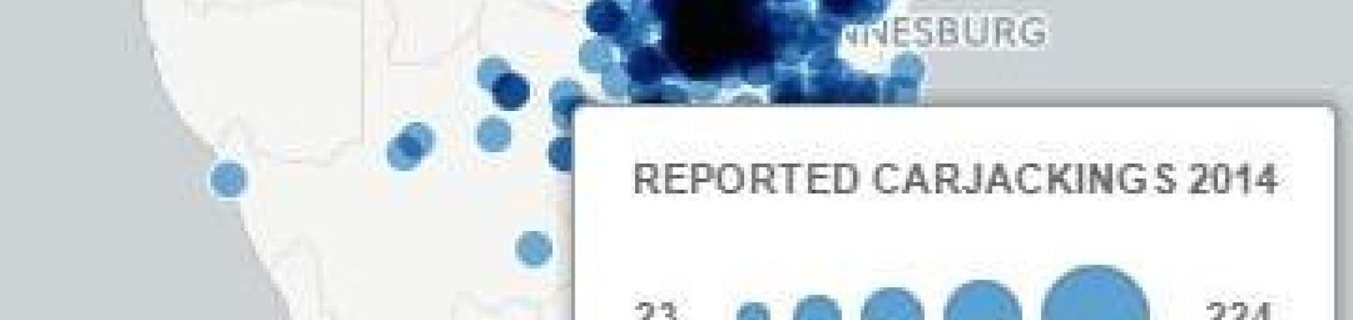
In this exercise we’re going to be mapping the number of car hijackings reported at police stations in South Africa in 2013/14, so both the shapefile and our dataset have the name of each police station in them. (You can use your own data, of course.)
Download the mapping practice data by clicking on these links:
- South African police station co-ordinates (click on “Export” and download as a shapefile).
- Car hijackings in South Africa (2013/14)
Step-by-step: Mapping reported car hijackings
1. Visit CartoDB and create a free account.
2. Next to your username is a menu. Navigate to “Your Datasets”.

3. You can now drag and drop the “carjackings_2013-14.xlsx” file into the browser window to upload it.

4. Once the file has uploaded it will automatically open in “Data View”, showing you the table with all the data. You’ll see we have carjackings for 2013 and 2014. Note that the name of the column with the police station name is called “police_station”.

5. If you click on “Map View” you’ll see an error that says “No georeferenced data on your layer”. This is because we have not uploaded the shapefile of the police stations that goes with this dataset yet.

6. So let’s go back to our datasets (arrow in top right corner) and upload the “Police_Station_Coordinates.zip” file, just like you did the first one by dragging and dropping it into the browser window.

7. When the file is uploaded it will automatically open in “Data View” again. (Note that the name of the column with the police station names is “compnt_nm”.) Now when you click on “Map View” you’ll see the location of all of South Africa's police stations on the map.

8. We need to combine the map data with the data on carjackings, so go back to “Data View” and click on the “Merge Datasets” button on the menu on the right of the screen.

9. The thing that both our datasets have in common is a column with the police station names. We will use this as a reference so that the datasets can be merged correctly, without things being moved to the wrong place. Select “Column Join” and then click “Next”.

10. CartoDB will now ask us which dataset we want to merge with and which columns it should match up when it combines them. In the right column choose the “carjackings_2013_14” dataset and then click the radio button next to the “compnt_nm” and “police_station” columns – it should look like this:

11. Click “Merge Datasets”. It will ask you to name your merged dataset. I’m going to call it “police_points_hijackings_merge” so I know what it is. Click “Next”.

12. Now we have a dataset that has the coordinates of each police station as well as the number of reported carjackings for 2013 and 2014. We are ready to make a map! Click on “Visualise”.

13. Name your map. I’m calling mine “Carjackings South Africa 2013-14”. Click “Create Map”.

14. Your new map will open in “Data View”. Let’s click on “Map View” – you’ll see the police stations are there but it’s not showing the difference in the number of hijackings reported yet. Click on the number “1” on the right hand menu to edit our first map layer.

15. By default the layer editor will open in “Wizard” view. CartoDB has built-in “Wizards” so you can visualise your data without any coding. (Watch a video explaining each visualisation type here.) Let’s choose “Bubble” as the visualisation type - this will show larger circles for police stations with more reported carjackings.

16. Let’s have this layer show carjackings for 2013. Make sure the column being used for the visualisation is “carjackings_2013”.

17. To keep things tidy, let’s rename our layer to “Carjackings 2013” by double clicking on the layer name.

18. "Quantification" controls how your data is grouped into different colours or sizes. (You can read about the different options here.) Let’s use “Equal Interval” for our map as this will ensure that outliers stand out.

19. You can also change the colours, the size of your bubbles and so forth. “Composite operation” determines how the colours blend with each other. If we choose “Multiply”, for example, it makes it easier to see areas with many police stations when we zoom out.

20. If you click on a dot on the map you’ll see a message that says “You haven’t selected any fields to be shown in the infowindow”. Let’s add information to display when we click on a point. Click on the “Infowindow” button below the “Wizards” button.

21. Let’s display the police station name and the number of carjackings for 2013 when users click on a point. You can turn your columns on or off by using the toggles to the right.

22. Now when you click on a point it will display the chosen information. You can change the order the information is displayed in by dragging and dropping the column names, so that the police station name is displayed first. We can also change the title – “compnt_nm” is not a very clear name. Let’s change it to “Police Station” by clicking on the “Change title labels” button.

23. If you click on a few points on the map you’ll notice that stations with zero car hijackings are also displayed. This does not make a lot of sense, so let’s tell CartoDB to show only stations where carjackings were reported.
For this we’re going to use a SQL Query – don’t worry, it’s very simple and you can just copy and paste it from this guide. It’s a useful query to know as you will probably need it again in future.
Click on the “SQL” button above the “Wizards” button. (SQL is a programming language for accessing databases.)

24. You’ll see that at the moment it says “SELECT * FROM police_points_hijackings_merge” – this means it’s pulling all of the data from our merged dataset. We want to tell it to only show values that are greater than zero, so we’re going to add “where carjackings_2013 > 0”. (“carjackings_2013” is the name of the column with the values we’re using.) Note that it needs to be written exactly as it appears in your data view. Click on “Apply query” and then you’ll only see police stations where at least one car hijacking was reported.

Note: you may have to reapply your “infowindow” and other settings after adding the SQL query. For the purposes of this tutorial we added it last to keep things clear, but it’s a good idea to do it first when you know you don’t want to display zero values.
25. Now you have a working map! Try and add another layer yourself with the 2014 data by clicking on the “+” icon at the top of the menu on the right – remember to choose the correct dataset. Once you have done this you can play with the options and add a layer selector so people can turn layers on or off. You can also add elements like a title or change the base map. Play around and see what you can do!

26. When you’re done you can publish your map (top right of the screen) and embed or share it. Here's our map:
More guidance
The Map Academy. Free online CartoDB courses for absolute beginners to advanced users. Highly recommended.
School of Data Mapping Skillshare – an informal mapping skillshare with Codrina Ilie, School of Data Fellow and PhD geospatial researcher.
Additional reading:
GUIDE: Tips to avoid three common statistical errors
GUIDE: How to get started with data visualisation
Add new comment