Tip #1: Be clear about 'percentage increases' versus 'percentage point increases'
 If the maths pass rate has increased by 30% from 17%, what is the pass rate now?
a) 22.1%
b) 47%
The answer depends on whether the 30% rise was a percentage (relative) increase or a percentage point (absolute) increase.
If the 30% increase was interpreted relative to the 17% pass mark, then it means the pass mark had increased to a) 22.1%.
The way you do the sum is:
- Work out what 30% of 17 is (30/100 * 17 = 5.1%),
- Then add your answer (5.1) to the original percentage (5.1 + 17 = 22.1%).
But if the 30% increase was interpreted as an absolute increase, then it means the pass mark has increased to b) 47%. (17 + 30 = 47%)
To ensure that people understand when you’re referring to an absolute increase, call it a “percentage point increase”.
Tip #2: Don’t assume that two things that happened at the same time influenced each other
Sometimes politicians, media and the public will look for a link between two events that doesn’t exist.
Statisticians use the terms “correlation” and “causation” to refer to different different ways that events can relate to one another.
Correlation
This refers to the degree of relationship between two factors.
Negative: When the one factor increases while the other decreases.
Positive: Both factors increase or decrease.
No correlation: One factor doesn’t change while the other increases or decreases.
Causation
On a website called Spurious Correlations there are funny examples of factors that appear to be have an effect on each other. One graph suggests that there is a relationship between the ages of Miss American beauty pageant winners and the number of murders by steam, hot vapours and hot objects in the US each year!
But just because there appears to be a correlation between two factors does not mean that change in one factor is influenced by change in the other, though. When one factor do directly influence another, statisticians call it causation.


Tip #3: Always check that a change in data between two time periods is statistically different
There’s usually no space in headlines for qualifiers. But journalists must be careful when they interpret and report on changes in data.
For example, each year the World Health Organisation (WHO) releases a global tuberculosis (TB) report. It provides estimates for TB deaths across the world.
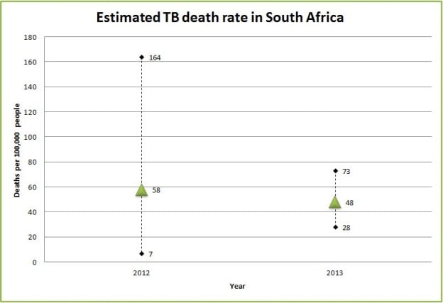
For 2012, the WHO estimated that 59 people died of TB per 100,000 people in South Africa. The next year they reported that the number had dropped to 48. At first glance it looks like the TB death rate had decreased in South Africa.
But we need to take into consideration that uncertainty exists about the exact TB death rate. The WHO has to estimate TB deaths because cases often go undetected or are underreported, a senior epidemiologist at the WHO, Philippe Glaziou, told Africa Check.
The WHO reports their estimated TB death rate with a 95% confidence interval. A confidence interval tells us about the reliability of an estimate.
This means that when the WHO’s estimated that the TB death rate was 58 per 100,000 people in 2012, they were 95% sure that the figure fell somewhere between 7 and 164, which is the “confidence interval”.)
The following year the WHO was 95% sure that their estimate of 48 deaths per 100,000 people fell somewhere between 28 and 73. The smaller confidence interval in comparison to the previous year means that the WHO was more confident about this range.

The average estimate for each year may look different, but they may not actually be statistically or significantly different because the confidence intervals of the two years overlap.
So be sure to ask the opinion of a study’s authors on whether the estimate for one time period is statistically different from the estimate for a second time period.
Additional reading:
GUIDE: How to create a map with data
GUIDE: How to get started with data journalism
GUIDE: The five-step fact-check
GUIDE: Rape statistics in South Africa


Add new comment