
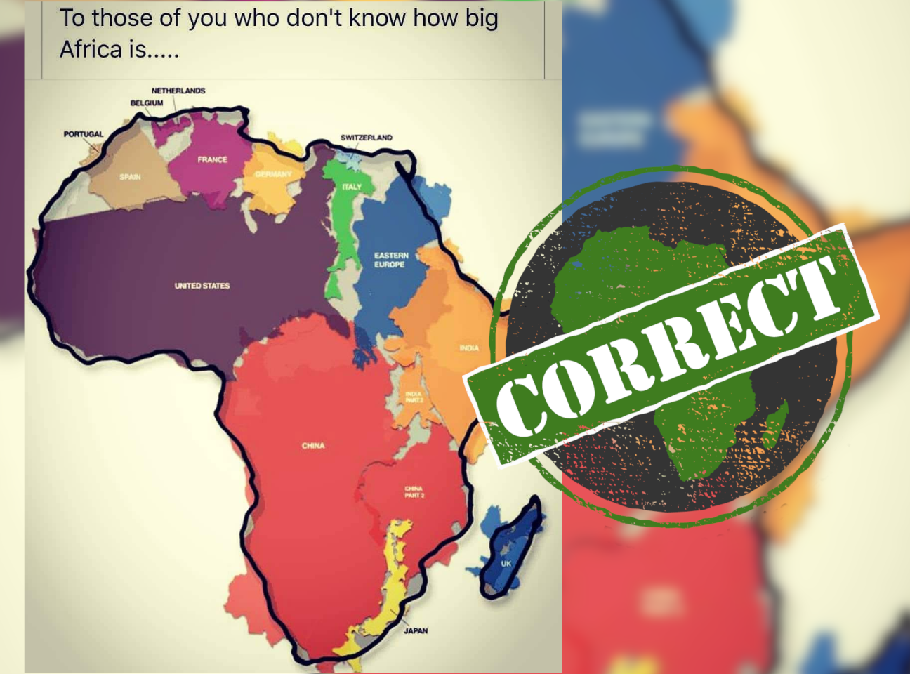
“To those of you who don’t know how big Africa really is,” reads the header of a map on Facebook.
The map is an outline of Africa, including the large island of Madagascar. Arranged inside are smaller maps in a range of colours, each labelled.
The labels read:
-
Portugal, Spain, Belgium, France, Germany, Switzerland, Italy, United Kingdom (countries in Western Europe)
-
China, India, Japan (countries in Asia)
-
United States (a country in North America)
-
“Eastern Europe”, with no individual countries labelled
Most of the coloured maps are rotated from the usual north-south and east-west axis of world maps, and some of them broken up, to fit into the outline of Africa.
The map suggests that the continent of Africa is at least as large as all of the labelled countries – and “Eastern Europe” – combined.
But Facebook’s fact-checking system has flagged the map as possibly false. Is it legit? Where does it come from? And is its data accurate?
‘Rampant immapancy’
Using a reverse image search, we found the map in a 2010 article on the website of National Public Radio, a US-based nonprofit. The article is headlined: “How Big Was It, Really? A New Way To Think About The News.”
Here the map is credited to “designer Kai Krauss” who, the NPR says, calls it “a small contribution in the fight against rampant immapancy”.
A Google search for “designer Kai Krauss map of Africa” led us to a page on Krauss’s blog, explaining the origins of the map.
“A few years back there was an exhibition in a London gallery by the Royal Geographic Society, and the curator asked the edge.org group to contribute ‘unusual maps’,” he writes.
Krauss is a member of Edge.org, a global group who discuss “the frontiers of knowledge in the areas of evolutionary biology, genetics, computer science, neurophysiology, psychology and physics”. His profile on the group’s website describes him as a software pioneer with a doctorate in philosophy and a master’s in image processing.
“Africa is so mind-numbingly immense,” Krauss says in his explanation of the map, “that it exceeds the common assumptions by just about anyone I ever met: it contains the entirety of the USA, all of China, India, as well as Japan and pretty much all of Europe as well – all combined!” (The italics are his.)
The idea, he says, was to “roughly put all of them as puzzle pieces somehow fitting inside the outline shape of Africa”. This would be “just a symbolic image – it may as well have been just blobs to tell the story, but it actually worked pretty well with the real pieces, at least enough to get the idea across”.
Data roughly supports map
Krauss links to a PDF with the original high-resolution version of the map, which shows it was created in 2010 – 11 years ago – and includes a table of the area data he used.
![]()
But there’s no explanation of which countries he included on the blue “Eastern Europe” map. (Eastern Europe is largely understood to be countries of the former Soviet Union, but the region remains undefined.)
Instead, the table replaces “Eastern Europe”, as well as Belgium and Switzerland, with:
-
Bangladesh (a country in Asia)
-
Greece, Norway and Sweden (countries in Europe)
-
Mexico (a country in central America)
-
Nepal (a disputed territory in Asia)
-
Papua New Guinea and New Zealand (countries in Oceania)
-
Peru (a country in South America)
Krauss doesn’t say whether the area of these countries, or of Africa, is total surface area or just land area. The land area of a country leaves out waterways.
But data from the World Bank and the CIA’s World Factbook indicates that his “symbolic image” does give a good indication of the “immense” size of Africa.
The problem with map projections
Why did Krauss produce the map?
He explains: “A survey with random American schoolkids let them guess the population and land area of their country. Not entirely unexpected, but still rather unsettling, the majority chose '1-2 billion' and 'largest in the world', respectively.
“Even with Asian and European college students, geographical estimates were often off by factors of 2-3. This is partly due to the highly distorted nature of the predominantly used mapping projections (such as Mercator).”
The Earth is a sphere. Displaying that sphere on a flat surface, in a map, distorts the size and shape of countries and continents.
The Mercator map projection, for example, makes land towards the north and south of the Earth seem much larger, and land in the middle, around the equator, seem much smaller. The equator runs through Africa.
Krauss says of his map: “Please do not take it all too literal ... and simply take that one impression with you: Africa ... is immense.”
Republish our content for free
For publishers: what to do if your post is rated false
A fact-checker has rated your Facebook or Instagram post as “false”, “altered”, “partly false” or “missing context”. This could have serious consequences. What do you do?
Click on our guide for the steps you should follow.
Publishers guideAfrica Check teams up with Facebook
Africa Check is a partner in Meta's third-party fact-checking programme to help stop the spread of false information on social media.
The content we rate as “false” will be downgraded on Facebook and Instagram. This means fewer people will see it.
You can also help identify false information on Facebook. This guide explains how.
Add new comment